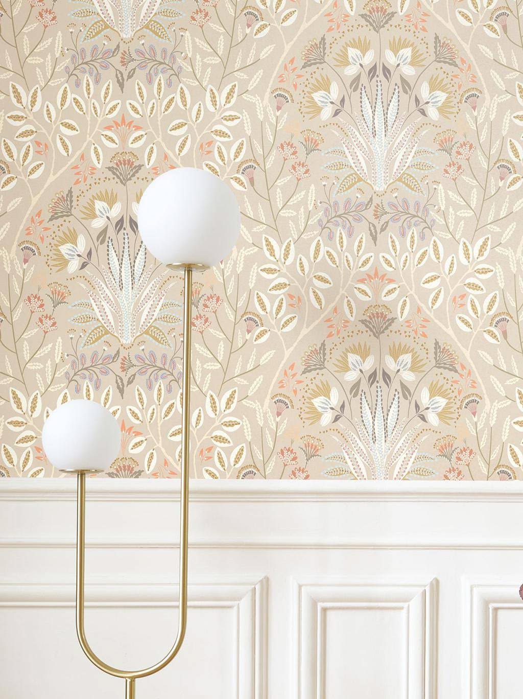
Wallpaper is often the star of a room. Whether it’s a bold floral, a subtle texture, or a playful print, it usually becomes the foundation for the entire design direction. But once the wallpaper is selected, one of the biggest questions becomes: What paint color should I pair with it?
When I’m helping clients choose a main paint color after selecting a wallpaper accent, I always start with one question:
How do you want the room to feel?
Moody? Neutral? Or light and airy?
The answer completely changes which tone within the wallpaper I choose to pull from.
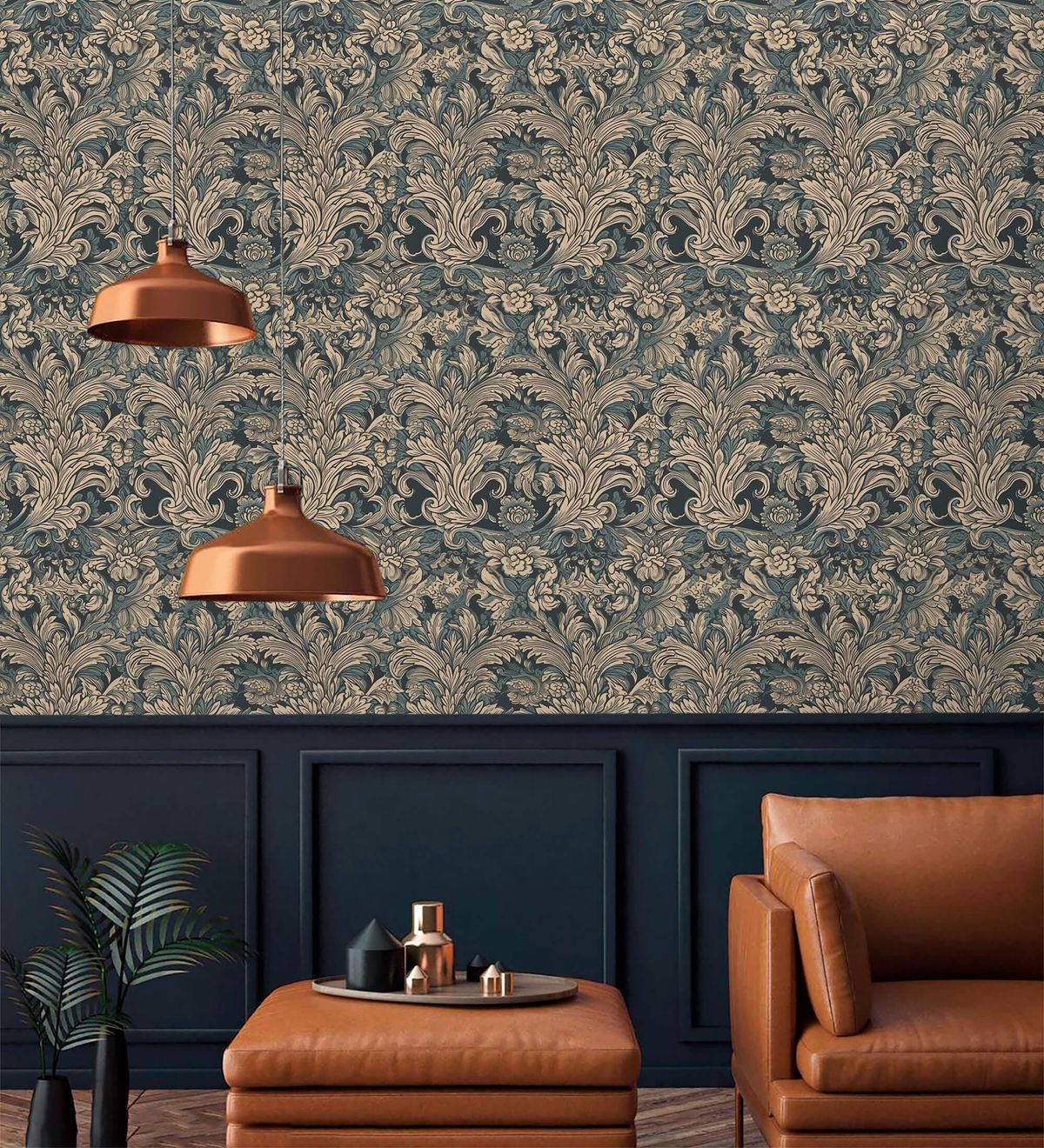
If You Want the Room to Feel Moody
For a rich, cozy, dramatic space, I look for the darkest tone within the wallpaper and match a paint color to it.
This creates depth and makes the wallpaper feel intentional and immersive rather than disconnected from the rest of the room. Deep greens, charcoal blues, warm browns, and earthy burgundies work beautifully for this approach.
The result is a space that feels layered, elevated, and cocoon-like — perfect for dining rooms, powder baths, bedrooms, or libraries.
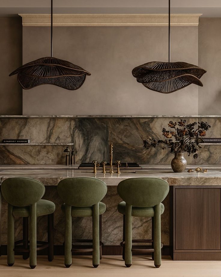
If You Want the Room to Feel Neutral
If you want balance and versatility, I recommend finding the medium-tone color within the wallpaper.
This is usually the easiest route for creating a timeless, cohesive look because medium tones naturally soften contrast and help the wallpaper blend seamlessly into the room.
Think warm taupes, muted sages, dusty blues, soft clay tones, or creamy mushroom colors. These shades help the wallpaper stand out without overpowering the space.
This approach works especially well in open-concept homes where you want flow from room to room

If You Want the Room to Feel Light & Airy
For spaces that feel fresh, bright, and calming, I pull from the lightest tones or highlights within the wallpaper.
This could be a soft cream background, a pale beige detail, a whisper of blue, or even a warm off-white hidden within the print.
Matching your paint to the lightest tone allows the wallpaper to feel soft and integrated while keeping the room open and airy.
This is one of my favorite approaches for sunrooms, bathrooms, breakfast nooks, and smaller spaces that benefit from feeling larger and brighter
Why This Method Works
One of the biggest mistakes people make when pairing wallpaper and paint is trying to choose a paint color independently from the wallpaper itself.
But your wallpaper already contains the perfect palette.
By pulling directly from the wallpaper’s darkest, medium, or lightest tones, you create a room that feels intentional, layered, and professionally designed.
Instead of competing with the wallpaper, the paint color supports it.
And the best part? This method works with almost any style — modern farmhouse, traditional, eclectic, coastal, rustic, or contemporary.
Final Tip
Before committing to paint, always test samples in the room throughout the day. Wallpaper colors can shift dramatically depending on lighting, and the undertones become much more noticeable once large paint swatches are on the wall.
Sometimes the perfect color isn’t an exact match — it’s simply the tone that captures the same feeling.