Choosing colors for a nursery is about more than style — it’s about crafting a space that feels calming, supportive, and joyful for both your child and you. While some parents are drawn to quiet neutral palettes and others to playful, colorful rooms, each aesthetic has meaningful pros and cons. The key is understanding how color influences mood and experience, and then blending elements in a way that feels right for your family.
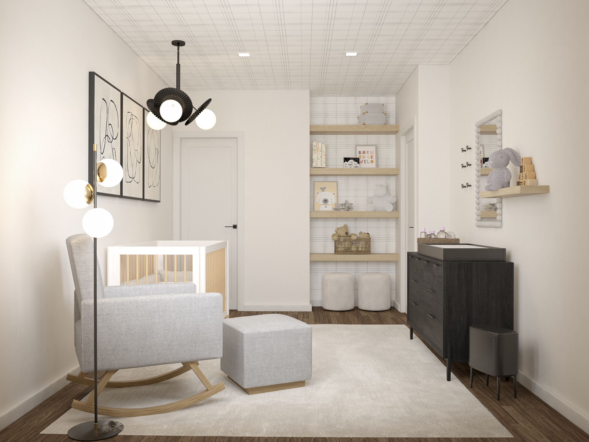
Minimalist, neutral-leaning nurseries often create a peaceful backdrop that supports rest and reduces visual clutter. Softer hues like warm creams, greys, or gentle earth tones can reflect light in a calming way and allow other design elements — toys, textiles, artwork — to take center stage without overwhelming the senses. Neutrals also offer longevity as your child grows, and many designers note that a tranquil base can make daily caregiving moments feel more soothing for tired parents, especially during night feeds or naptime routines.
On the other hand, introducing color — whether through soft pastels, gentle accent walls, or lively décor — can add visual interest and enrich the nursery as your baby’s vision develops. Light shades of green, blush, or muted yellow can support gentle engagement without overstimulation, especially when balanced with calm neutrals. Too much bright, saturated color across every surface, however, has the potential to feel busy or alerting, particularly in a space meant for sleep.
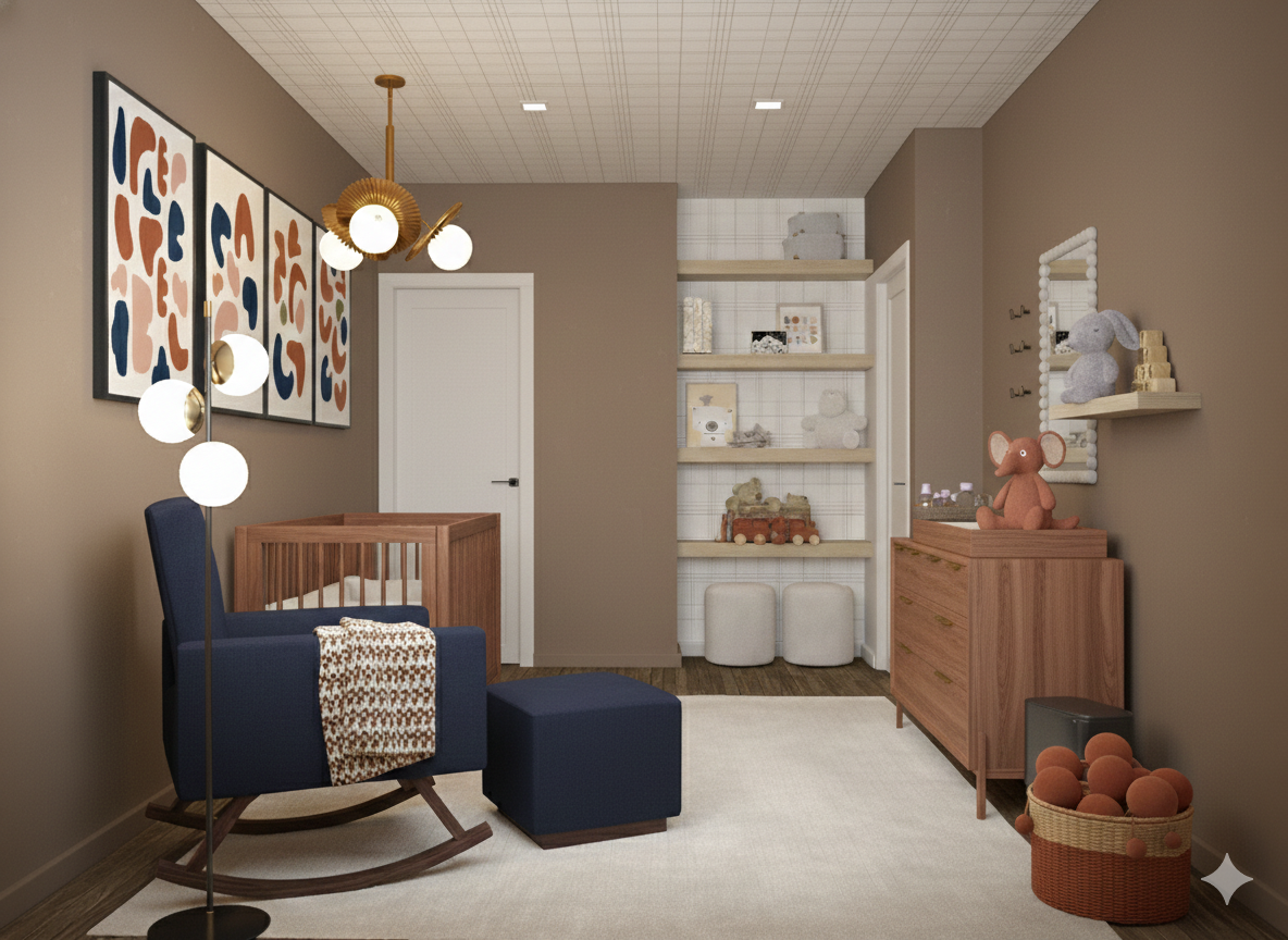
The real design opportunity lies in mixing the two approaches. A soothing neutral foundation paired with carefully chosen colors in textiles, mobiles, or feature walls lets you enjoy both calm and character. This balanced palette allows the room to feel restful without feeling sterile, and colorful without feeling chaotic. Ultimately, the best nursery is one that supports your child’s well-being and feels like a comforting, joyful place for you — because nurturing your own sense of calm and connection matters, too.
Nursery color isn’t about adhering to a strict rule; it’s about choosing a palette that supports rest, play, and emotional comfort. By thoughtfully combining calming neutrals with selective pops of color, you can create a space that grows with your child and nurtures both of you along the way.